Matt’s Notes
Making it up as we go is our M.O.! #ednontech
This week has been interesting from a work perspective, and from a life perspective. Rather than attempt to relate how specific aspects of this relate to the topic du jour, I present for your consideration the latest installment of Matt’s Emails to His Bad Self!
Wilco Loft Sans Font
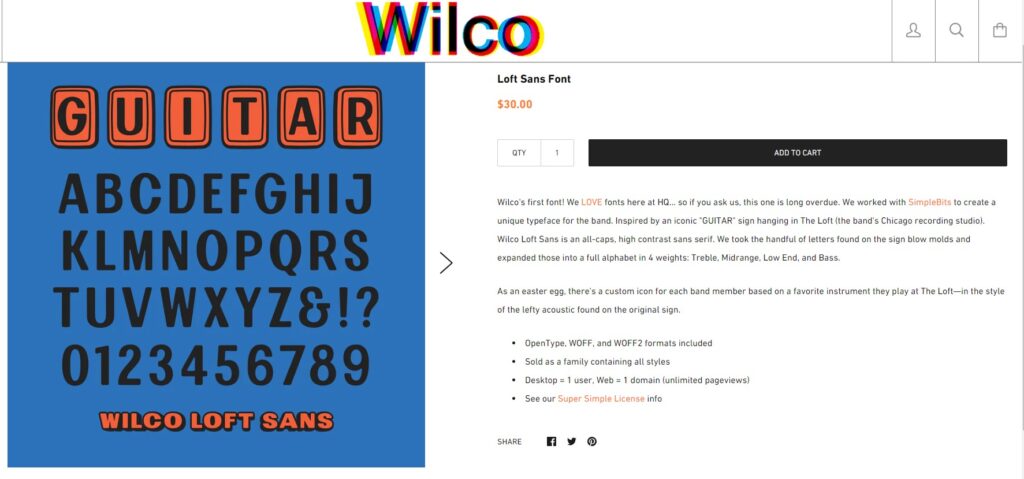
As mentioned during the show, this is the kind of thing I would have immediately purchased not that long ago.
For every IPA fan who also will spill hundreds of dollars for the 11XLP Super Deluxe Edition of Yankee Hotel Foxtrot, there is a robust compliment of middle-aged dads who will most definitely shell out the thirty American dollars to impress their friends and acquaintances.
I’ll go back to our discussion last week as far as curation and fandom: if Paul Westerberg put out a font… not only would I be buying it, I’d be blogging about it… and posting about it on fan groups… and probably doing a countdown on the punk podcast for when such release would be available…
Curatorship… fandoms… and fonts… are all places that I am glad to see this podcast going!
Metal Mania & Zen Antique: My Tale of Two Fonts
Back around this time last year, the Ed non-Tech Podcast was in its early episodes and Dan and I were getting ready to record the first… or zero-eth, rather… episode of Today New Brunswick, Tomorrow the World.
To the extent that I wanted the two pods to have a “similar-but-different” feel in terms of format and presentation, a goodish amount of time was spent on selecting the WordPress theme for each. As any WP enthusiast can tell you, themes are just about everything… the “clothes” your site wears in public…
In both cases, I opted for minimal themes to focus attention on relatively simply content intended to be reupped on the regular.
In the course of my twiddlings and researchings I came to really dig… quite arbitrarily… Zen Antique as the main font for this site… which is a Google font rendered across the WordPress site by the Google Fonts Typography plugin… which functionality is reached after installation through the Customize option under the Appearance menu. With TNB/TTW, we’re using the RetroGeek theme which has a courier / typeset font which I seriously enjoy… with Metal Mania used for headings across the site through the same Google Fonts plugin..
UNESCO: Guidelines for the governance of digital platforms
Thanks muchly to LinkedIn for keeping me in the loop on the important work UNESCO is doing in the digital sphere! I am about as much of a social media user as you can be, and while I’m vaguely chagrined about this outcome, as I’ve said… for better or for worse, Zuck is our generation’s Gutenberg (he of “printing press” invention fame, circa 1450).

Anyway, all that will keep the hypercapitalist technocrat oligarchs from grinding us all into atoms is an interested, engaged, motivated, participatory public.
And so the value of documents such as these!
How to create SCORM
I’ve been looking at LMS from every which-way owing to work lately and this is increasingly a thing on an initiative lately! To paraphrase Marge Simpson: I just think it’s neat!
The Lawrence Arms: Oh, Calcutta!
I’m a huge fan of long-running Chicago punks The Lawrence Arms, and you should be too! I’ve included what I’m thinking may be the first EDUCATIONAL PUNK H5P below… and they have a pretty cool font for their record covers & whatnot… so this isn’t completely a gratuitous reference. But, you know, very nearly.

Doug’s Notes
Fonts and presenting educational material

The presence of san serif fonts was found to be significant … This suggests that approximately 9% improvement in recall. The spacing of the font was shown to be non-significant.
Gasser, M., Boeke, J., Haffernan, M., & Tan, R. (2005). The Influence of Font Type on Information Recall. North American Journal of Psychology, 7(2).
… the presentation of the text has a significant effect on a text’s accessibility for people with dyslexia.
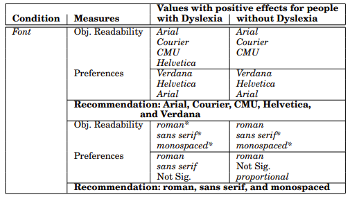
… dyslexics with a lower reading level improved more with the condition Yellow-Dyslexie in comparison with all the other conditions than did dyslexics with a higher reading level.
Pijpker, C. (2013). Reading performance of dyslexics with a special font and a colored background (Master’s thesis, University of Twente).
… 10 – 17.5% of the population have dyslexia. … reading is essential for success in our educational system.
The results can be summarized as size matters, spacing doesn’t.
Rello, L., & Baeza-Yates, R. (2016). The effect of font type on screen readability by people with dyslexia. ACM Transactions on Accessible Computing (TACCESS), 8(4), 1-33.
Low vision readers … the objective measures (reading time, reading accuracy and fixation duration) show less effect of the Luciole font on readability.
Galiano, A. R., Augereau-Depoix, V., Baltenneck, N., Latour, L., & Drissi, H. (2023). Luciole, a new font for people with low vision. Acta Psychologica, 236, 103926.
Word of the podcast
Fonts
Phrase of the podcast
Spend thirty dollars on it! Why not?
Question of the podcast
How are educators making decisions regarding font choice in educational endeavours?

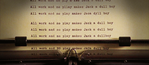
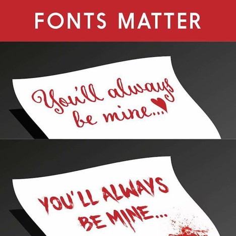
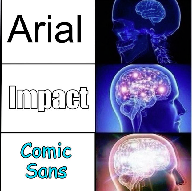
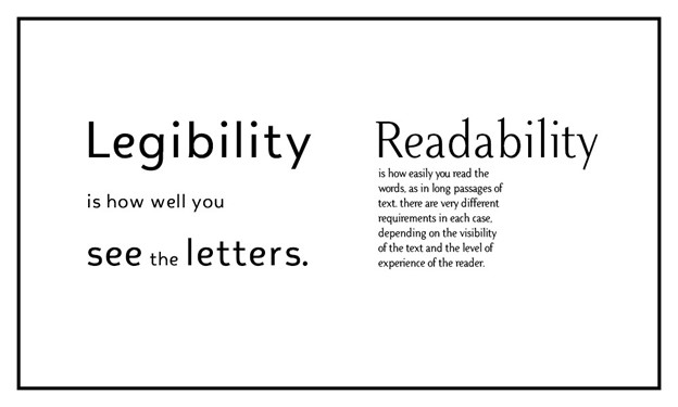
Any chance anyone can decipher this for me? Why fonts matter…
Pretend I am forever young
And I bleed every ribbon dry
Waiting for my day to come #ednontech

We greatly (really!) appreciate you visiting these here podworld parts!
Podcast: Play in new window | Download